User Research - UX/UI Design
An App That Lets You Easily Buy Tickets and Order Food
In 2020, movie theater attendance dropped sharply due to the pandemic, reshaping how people engage with entertainment venues. As theaters began to recover, I explored whether customers were turning to apps to streamline ticket and food purchases. To address this, I designed and tested a movie theater app, culminating in a final usability test where 4 out of 5 users highlighted the ease of completing a purchase. This case study was completed as part of my journey to earning Google’s Professional UX Design Certificate."
The problem:
Movie ticketing apps can be hard to use; they contain unnecessary information and features. Some apps do not offer the option to pre-order food and drinks.
My role:
User Research - UX/UI Design
Duration:
June - October 2022
Week 1- 4: Research
Survey
Competitor analysis
Persona
User journey
Week 5 - 8 : Ideation
Paper wireframes
Digital Wireframes
Usability test
Week 9- 12: Iteration / Final design
Usability test
Mid Fidelity Wireframes
Style guide
High fidelity prototype
Research
Gathering data
Survey
My research began with surveying 10 individuals to identify which apps they were using and if they had any pain points. To my surprise, I discovered the following:
Pain Point #1
Screens are long and loaded with too much information.
Pain Point #2
Users have to take many steps before completing purchase.
Pain Point #3
Users are not able to purchase snacks ahead of time.
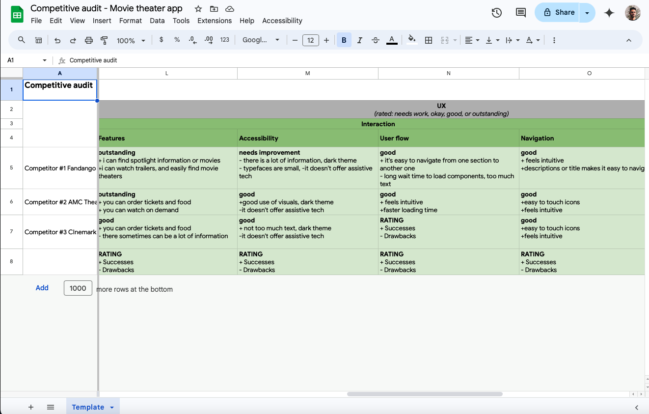
Competitive Analysis
I compared three different mobile applications and analyzed their experience and Interfaces. Categories analyzed: first impressions, interaction, visual designs, and content.
Personas
After conducting a survey and a competitor analysis, I created two user personas to familiarize myself with the potential users.
Ideating
Sketching Ideas
Since this was my first solo project, from start to finish, I made several paper wireframes to test different designs before moving on to digital wireframes. This experience taught me that sketching is a quick and effective way to eliminate unnecessary features.
Paper Wireframes
Lo-fi Digital Wireframes
Usability Tests and Mock Ups
Throughout the design process, I conducted three usability tests, underlining the importance of iterative design and testing to ensure the app's quality and functionality.
Bottom Navigation Bar
After getting feedback from other designers, I redesigned the bottom navigation bar to include a home button. This change yielded a positive response from users on the second usability test.
This was an important lesson as it demonstrated that constructive criticism can positively impact design and enhance the user experience.
First usability test:
it was observed that 4 out of 5 participants found the time slots on each movie image confusing. This resulted in users trying to select their preferred date; this was not the intention of the design. Therefore, I removed the time slot to avoid confusing the users.
Second usability test:
3 out of 5 people mentioned that the images of each movie seemed small. Increasing the size of the image and typeface made the screen more accessible to everyone.
Users also confused the "Coming Soon" section with the "Current Playing Movies" section. To resolve this issue, I used two colors for each section and added a title for the next phase of the design.
Iterating
Home Page
Select Time and Date Screen
First usability test:
It was observed that 3 out of 5 participants found selecting the time and date of movies confusing. They mentioned the language and structure of this feature were not user-friendly.
I consolidated the time and date selection, structurally and visually. I also added an interactive component, highlighting only the available times and dates to help guide the users.
Second usability test:
It was observed that 3 out of 5 participants had difficulty selecting the time and date of movies. They also mentioned wanting to have the ability to book tickets for upcoming dates, and having those dates visible was preferred.
As a result, I created a prototype where users can slide to select the dates and times, making it feel more intuitive. This change also improved the visual aesthetics of this section.
Select Seats Screen
First Usability test
Users expressed that the results of the selected seat needed to be more apparent.
As a result I created a box with a different color to highlight the seats selected by the user.
Second Usability test
It was observed that 3 out of 5 participants found it hard to select a seat using the current map seat.
I made the square symbolizing seats bigger and created a more spread-out design.
Prototype
Lessons learned:
This case study emphasized the importance of iterative design and testing. Continuous feedback from users helped refine the app and ensure it met their expectations.
Getting feedback from more senior designers can yield important discoveries.
Integrating the pre-ordering feature for food and drinks addressed a common user complaint. It can potentially open up additional revenue streams for theaters, highlighting the dual benefits of user satisfaction and business profitability.
Impact:
After fully prototyping the app, I conducted a third usability test. 4 out of 5 users mentioned how easy it was to complete a purchase using this app. 3 users said that they would prefer to use this app rather than the existing apps.


